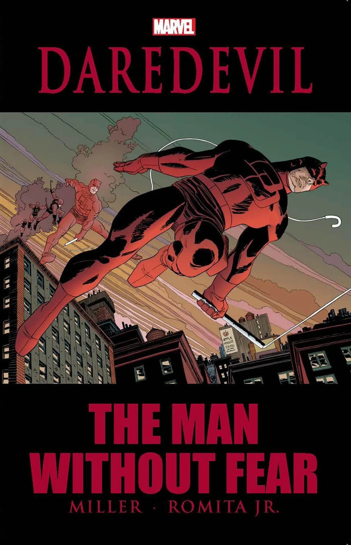
Writer: Frank Miller / Penciller: John Romita Jr. / Inker: Al Williamson / Colour Artist: Christie Scheele / Letterer: Joe Rosen / Editors: Ralph Macchio, Mark D, Beazley / Collects: Daredevil: The Man Without Fear #1-#5 / TP / Marvel Comics
Article by Paul Dunne
19th March 2025
The Pitch: A fire burns deep within Matt Murdock. He was raised by a single father, an over-the-hill prizefighter with one last chance to make it good - a chance that cost him his life. Taunted and tormented by children while growing up, Matt's life was irrevocably altered after he was blinded by radioactive materials while saving the life of an old man. The payoff? An unbreakable will and a keen intelligence, helping focus the super-senses he was blessed with during the accident. His story is one of love, pain, disappointment, and strength. Witness the tour-de-force origin of the Man Without Fear by industry legends Frank Miller and John Romita Jr.
In an art form where many hands contribute to the success of a book, it's always fascinating how one writer can indelibly shape a comic character so that everyone who touches that character afterwards is forever in their wake or their debt to one degree or another. Such is the case with Frank Miller and Daredevil. Starting as penciller on the series before becoming its writer, Miller had a seminal run on the book, eventually leaving for the world of creator-owned titles. He left his mark on the book, and that mark never left. Despite the weirder, darker places that Ann Noncenti's much-loved run took Daredevil to, Miller's seventies crime film-immersed leanings stayed bolted on. Not only did the readers like it, other writers did too. Tempted back, Miller was due to present a one-shot, updating and expanding Daredevil's Origin. But once Miller and John Romita Jr began to cook, they decided their entree needed to be a feast. They were here to take over the whole (Hell's) Kitchen!

Looking back on Man Without Fear now, a couple of things leap out at you. First is the approach. It's a linear story, that doesn't start in media res. Today, I think you'd be hard-pressed to find a comic that didn't start somewhere in the middle and tease the beginning out as the story progressed. But that's just the nature of modern entertainment writing. Many of us take the screenwriter's approach of 'arrive late and leave early' when it comes to scene construction, and comics are a great medium for the lovers of a flashback. Here, you're led on a sequence of events, one by one beginning to end, building to an inevitable showdown that smacks of destiny.
Then there's the writing itself. Marvel had always been the wordier of the 'big two' publishers as it was. And DC had begun leaning into the graphic novel approach as the Vertigo line came into being, springboarding gradually off the back of Alan Moore's wonderfully purple prose in Swamp Thing a decade earlier and thesaurus in hand. Books in the nineties were going to be extreme in both bombast (Image) and talk. There's a novelistic, dare I say, storybook approach to Man Without Fear. Miller externalises the inner life of the characters, using an omniscient voice, unseen and godlike, to tell us about the early days of Matt Murdock and the woman named Elektra that he fell in love with. Ultimately, MWOF leans into the tragedy of Matt's life, right up to the end.

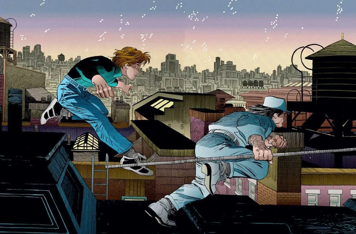
It's the final panels, the ones of Matt leaping over the rooftops that bring to mind something else I noticed about the book. Something that, for some reason, I hadn't picked up on before, although now I don't know how I missed it. MWOF leans heavily on Batman: Year One. Obviously, they're both origins. But beyond that, Miller creates a kind of poetic resonance between the two works. There are similar beats and moments, but it's more than that. There's a deep sharing of mood and emotion. There's a rhyming rhythm to MWOF and Year One. Both characters learn by getting it wrong. Although Year One lacks 'the great love interest', the sense of tragedy is the same. For Bruce, it's losing Gotham to corruption. For Matt, it's losing his heart to Elektra.

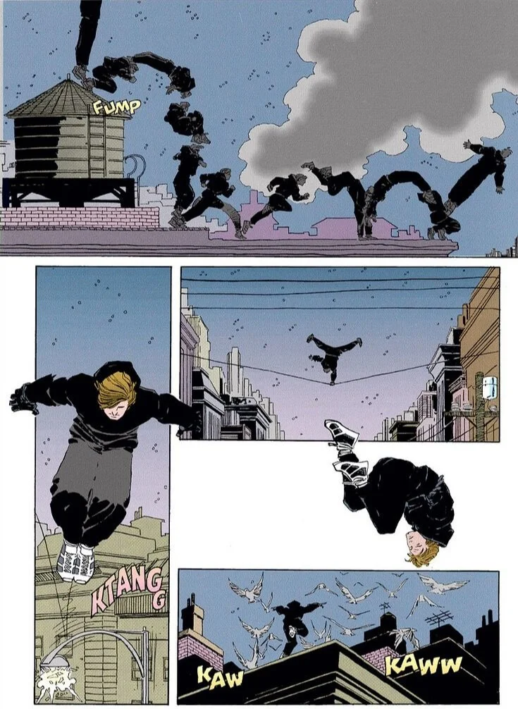
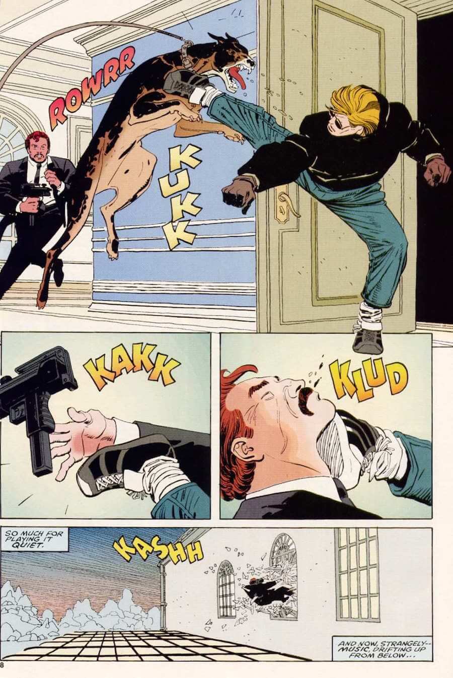
Romita Jr. may have never been better. He creates space, using his expressive lines and expressive faces to move the story. Matt is portrayed as a curious, adventurous spirit. Foggy is the archetypal slob with a heart. And Elektra? Romita Jr's pencils imbue her with the scent of dangerous sex. She is an almost supernatural presence, a malevolent poltergeist, wrecking all in her path for her own amusement. Romita Jr creates a textured New York, where the smell of garbage stings your nose on hot summer days and the soft snow stings your skin in the winter. His figures are extreme in the action scenes, which really helps sell the almost impossible athleticism of Matt and Elektra. He also takes care to give us real New York faces that wouldn't have been out of place in The French Connection, The Seven-Ups or The Taking of Pelham 123. For most of us reading comics here in England, films and TV would have been the first and in some cases, the only way we ever experienced America. New York was a dangerous, exotic place where you couldn't see the top of the buildings, kids busted open fire hydrants in the summer and crime lurked around every corner. Romita Jr extends that feeling into the pages of MWOF.
Interestingly, Al Williamson's excellent inks add an organic, fungal, fuzzy quality to the characters, their clothes, and their hair... and those ink strokes make Romita Jr's art look like Frank Miller's. So there are wheels within wheels on this, connective tissue that runs through the veins of the book. There are times when inking is the invisible art of comics but not here. Williamson's inks have definitively made a difference to the panels, and both he and Romita Jr are channelling Miller. Christie Scheele's colours add the warm blues and eerie blacks of the New York night as well as the stark whites of Columbia U in the winter. Her Times Square is a burst of neon and bulbs. As much as I adore black and white inked art, and have grown to appreciate it more over the years, colours make the book live in many instances and Scheele really seems to be a master of her art. Joe Rosen also does terrific work, employing a classical lettering style that recalls the comic sans of Watchmen a few years before. Man Without Fear is not a great introduction to Daredevil comics, but a fantastic introduction to Daredevil, even if the costume is absent until the very end. It remains in the fullest sense, a graphic novel in the Marvel sense of the term and should still be essential reading for anyone setting out to discover the character.